Altair offers an elegant interface and its own plotting language in a Python libraries. The plotting libraries available in Python offer multiple ways to present data according to your preferences, whether you prize flexibility, design, ease-of-use, or a particular style.
Shaun Taylor-Morgan
Plotting in Altair delivers a different solution than others which I find to be simpler as the amount of plotting done scales. It has an elegant interface, thanks to Vega, the declarative plotting language that allows you to define what your plots should look like, rather than writing loops and conditionals to construct them.
Fluent in plotting
I compare each Python plotting library by plotting the same multi-bar plot. Before we go further, note that you may need to tune your Python environment to get this code to run, including the following.
- Installing a recent version of Python (instructions for Linux, Mac, and Windows)
- Verify that version of Python works with the libraries used in the tutorial
The data is available online and can be imported using pandas:
import pandas as pd
df = pd.read_csv('https://anvil.works/blog/img/plotting-in-python/uk-election-results.csv')
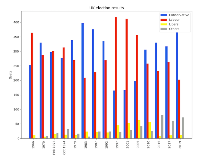
Now we’re ready to go. As a point of comparison, this is the plot we made in Matplotlib:

The Matplotlib plot took 16 lines of code to create, including manually calculating the positions of each bar.
Here’s how to make a similar plot in Altair:
    import altair as alt

    chart = alt.Chart(df).mark_bar().encode(
        x='party',
        y='seats',
        column='year',
        color='party',
    )

    chart.save('altair-elections.html')
Much more concise! Just like Seaborn, Altair works with data that has one column per variable (Long Form). This allows you to map each variable onto an aspect of the plot—Altair calls these aspects “channels.” In our case, we want one bar per party on the x-axis, we want the seats each party won on the y-axis, and we want to group the bars into columns by year. We also want to color the bars by party. That’s how you would describe it in words, and it’s exactly what the code says!
Here’s what the plot looks like:

Tweaking the style
That’s not too far from what we want. The main difference from the Matplotlib plot is that each Altair year group is displayed with a little white space in between—this is just a feature of Altair’s multi-bar plots, and it’s not a problem.
However, there are a few other little style improvements that we do want to make.

